
5 Common Storefront Signage Mistakes That Cost You Customers
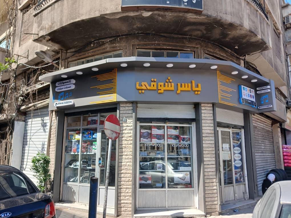
Before any customer walks into your store, they see your sign first. Numerous studies confirm that customers form their first impression of a business's quality from its exterior signage within seconds. Here are the 5 most common mistakes we see, and how to avoid them.
1. Text too small or unreadable from a distance
A sign needs to be readable from a distance, not just from the doorstep. Overly decorative fonts or small letter sizes make drivers and pedestrians miss your store entirely. General rule: every 2.5cm of letter height is readable from about 3 meters away.
2. Colors that don't match your brand identity
Many business owners pick sign colors randomly without tying them to their logo or interior design. The result is a scattered visual identity that weakens brand recall.
3. Insufficient or uneven lighting
A sign that looks great in daylight can become completely invisible after sunset if lighting isn't calculated properly, especially since a large share of foot traffic happens in the evening. Illuminated letters or an evenly backlit panel solve this permanently.
4. Ignoring sign size relative to the storefront
A sign that's too small gets lost on a large facade, while an oversized sign on a small storefront looks unprofessional. The right proportion between sign size and facade creates a balanced, professional impression.
5. Using cheap materials that cost more later
Cheap flex or vinyl fades and cracks within a few months under sun and rain, meaning frequent replacement costs. Investing in higher-quality materials and printing from the start is more economical in the long run.
At Al Andalus, we design and build storefront signage using the latest techniques — from cladding to illuminated letters, flex, and vinyl — while accounting for all these details to ensure your sign actually attracts customers. Contact us to review your current sign or design a new one.